Thursday, 29 September 2016

Shot list: Alice in Wonderland 2010


0:13- Long shot of Disney Logo (the castle)
0:16- Long shot of old classic house (first setting of trailer)
0:17- Medium shot of protagonist Alice
0:19- Low angle over the shoulder shot, over Alice's shoulder
0:21- Long shot, straight on angle of Alice and male character
0:22- Medium shot, straight on angle of Alice and male character
0:24- High angle, close up of male character
0:25- Low angle, close up shot of Alice
0:27- POV shot showing people at the party watching Alice
0:29- Cut to POV of people at the party's point watching Alice straight on angle
0:31- Medium shot of Alice being the main focus with characters in the background
0:32-Close up shot of Alice with slight low angle
0:34- Quick panning shot of Alice running past
0:36- Jump-cuts to where she has run to long shot of Alice
0:37- Low angle shot from inside a hole of Alice
0:38- Medium shot from behind Alice looking down into the hole
0:39- Same low angle as (0:37) but more close up to Alice
0:41- POV shot from Alice falling down the hole
0:42- Low angle shot as the camera is positioned underneath Alice watching her fall
0:44- Switches to the POV of Alice still falling
0:48- Close up shot of Alice opening a door
0:50- Extreme longshot of spooky castle with clouds and mountains beside
0:52- High angle shot of new characers tweedle dee and tweedle dum and the rabbit
0:55- Long shot of the Queen of Hearts
0:57- Close up shot of the Cheshire cat
1:00- Long shot of abandoned looking house


From this I have established and gained understanding of what types of shot I will need to include in my trailer to ensure its a successful one, I've learnt  that I would need around one/two shots per second using a variation of shots. Also show different characters however the protagonist the most so this is easy for the audience to notice immediately.

Tuesday, 27 September 2016

Short Film

As intended and mentioned in my diary post I have now finalised my short film which explores a variation of camera shots and angles. This has been extremely useful and beneficial to me as they have given me more understanding on how the camera works in itself and how to get the best out of every shot with the positioning of the camera. We also got to edit these shot films that gave us a reminder of how to use as over the summer these amazing techniques my have become slightly sparse in our memory. Hope you enjoy,

Saturday, 24 September 2016

The Girl on the Train (2016) Inter-titles Analysis


This movie is a mystery thriller therefore the inter titles are vital for the trailer to build tension and suspense for the audience.


The first inter title we see as an audience is a white background with black writing, wording 'One week ago' at 0:19 seconds of the trailer this gives the trailer to jump back in time and reveal the beginning of the film or dilema. This also adds enigma to the trailer and gives us a hint on the narative, As the film was originally a book the simple 'type-write' looking font adds to the book theme as it looks like a chapter title.


The next inter title we see is another chapter like title reading 'At 4:36 pm' again this revealing more of the narrative and building tension as this time is very specific so something significant must happen at the moment in time.


The third inter title we see is at 0:31 again with the same white background and black writing theme. It now is revealing the dilemma in the movie 'A woman disappeared' this again is building tension as the audience begins to ask questions...such as who is the woman?


0:38 is the point the inter title begins to change as it no longer telling a story with the titles instead adding film related things,so no longer need the white background and black writing like a book. The black background seems like a shadow to add mystery and a chill to fit the genre and entice the audience.


The penultimate title is showing us the producers of the film using the same technique as the previous with the words lurking in the shadows of the black background.


The final title is the title of the film with the words randomly placed in no order adding to idea of confusion and mystery of the film with again the black background with white writing as the words appear individually adding tension even for the titles.

From the research of these intertitles I have been inspired by the order of the inter titles as I intend to put the title of the film as the final title and at the very end with the production companies previous. I also like the idea of adding titles in to reveal part of the narrative.

Thursday, 22 September 2016

Diary Post #1

Hi there!
I have been really trying to improve my filming skills to improve on my film making, to do so I had to embark on creating a short clip showing a variety of camera shots, angles and positioning me and two  of my media team headed out using just a tripod and camera to practice our camera filming skills and work on them and see what we needed to improve. In my next post you can see the results of this tasks! 
Olivia

Sully (2016) Sound Analysis


The start of this trailer relating to sound we are met with soft non-diegetic sound of a piano playing as the trailer is slowly progressing, this fades away and a voice over is entered still with slight piano playing 'sully' the main character is describing what had happened in this disastrous event of his plan crash. Even though the music is calming it still prepares for the eventual tense narrative as it builds a mysterious idea. The fuzzy voice over represents the pilot and is recognisable to the audience to understand sully's occupation.
Once the climax of the trailer is reached the non-diegetic sound is an adventurous soundtrack, with dialogue from the film of shouting and 'Brace!' representing danger fitting with the sound the music gets faster as the cuts get faster and any diegetic sound disappears when the finishing titles comes up and the soft tranquil music is back as if a sense of relief.

Wednesday, 21 September 2016

Magazine Pencil Draft


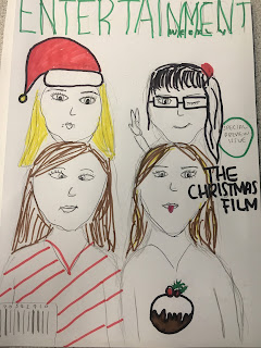
This is mine and my co-workers first magazine draft, these are the 3 stages we encountered. We intend to have the four characters from our film positioned like above pulling funny faces to show the tone of the film. Christmas props are needed to make sure its clear it is a Christmas film as if it was to be seen on a shelf in a shop it needs to stand out! Also we are currently using a working title. As in a previous post we are still using Entertainment weekly as our distributor. 


Empire (The Hobbit) Film Magazine Analysis


Total Film (Alice in Wonderland) Film Magazine Analysis


Film Poster Planning

Today I took time to think about the extra material needed to create the promotion of my film, not just the trailer, I research different film posters to give me inspiration for the layout of my poster and how will all come together and eye-catchy for an audience . So here is my first initial design for my film poster, the idea I wanted was to have two of the actors in the foreground staring (happily) at a very large public Christmas tree with everyone around frozen and out of focus as they are so madly in love. Our film title will be situated at the very top with actors/actresses name forming the shape of the tree bedside it, with also our website at the very bottom. It will be full of colour and the Christmas spirit. This gives the audience a slight hint of the narrative for my film that it will include romance and a happy ending as the poster will be merry.

Bridget Jones' Baby (2016) Poster Analysis

The genre conventions of this film poster show it is British Comedy/ Chick Flick. We know its British because of the actors and as it is a follow on from film from the original 'Bridget Jones' so audience know the comedic elements to expect. The chick flick conventions come in through the colour used and the protagonist female being the main focus. Pink and Purple has feminine connotations and its pleasant to look as the colours feature well together.As an audience we are made to look at the main image of Bridget Jones herself with a pair of pants in front of her self creating a funny tone, with a phrase above 'we're going to need bigger pants' also adding comedy and suggesting she could face common problems during this pregnancy. The spacious empty background remind the audience of the simplicity of the film and how it is easy to identify with this character as not to much is going on. This is a teaser poster as it doesn't exactly tell you a date it is out just the year inviting the audience in to the process of revealing the promotion of the film and makes it anticipating for the audience.
From this trailer I am inspired to take the vibrant girly colours from the title as they work well together and are appealing to the eye. I would also take the idea of having just one female character as the main subject of the poster to show it is a chick flick immediatley.


A Cinderella Story (2004) Poster Analysis


When looking at this poster an audience member can instantly recognise the generic conventions of the genre, chick flick mainly because of the characters and their positioning on the poster. Automatically having a female and male character suggests romance and a happy ending and like the traditional 'Cinderella' also has a happy ending so we know this will happen because of the immediate title. The caption 'once upon a time...can happen anytime'' gives the audience a sense of excitement as its slightly revealing a story of excitement, romance and teenage life. The preppy vibrant font used for the title gives a youthful feel and the blue links with the traditional story of Cinderella because of the original blue dress. It is clear to see how it will follow the usual narrative of a chick flick as its a unexpected love affair where girl meets boy and lives happily ever after.

From this poster I would take the emptiness as I think is really effective it allows us to focus directly on the characters and tells us its a all to do with romance, I also like the positioning of the characters and how the text is formed around them. It shows the relationship they have and suggests a romantic feel.

Tuesday, 20 September 2016

Planning Of Film Magazine

It's time to start focusing on the few elements that will be promoting our film nationally, first was our film poster intial planning now our film magazine. From research me and my partner have decided that the magazine we intend to use the company 'Entertainment weekly'. Reasons for this is because 'Entertainment weekly' promote a variety of films with different genres and varying from big Hollywood block busters to smaller independent films like mine!


Image result for entertainment weekly bridget jones

Diary Post: Film Production Update

Throughout planning, for mine and my co-workers ideas to merge well together we had to in some ways create a new genre, this being a Christmas themed chick flick! There isn't a lot of films out there with this theme. We both love Christmas and love chick flicks so our ideas are constantly following. Therefore previous research has been mostly about chick flicks but with the new element of Christmas research into these films will be needed. I am extremely excited for this. It has stayed Chick Flick from my inital idea but the season and theme of a holiday has completely changed.

Wild Child (2008) Theatrical Trailer


We first get introduced to the protagonist 'Poppy' she is a 'typical' american teenager who has  a great lifestyle suggesting what could go wrong for her? Making it clear its a chick flick genre as it includes a main girl and a problem is going to occur. She is dressed in a stereotypical colour of pink representing her girly glamorous culture.


The split screen of her glamorous lifestyle again makes us think what could go wrong in her life, as audience members would envy this life. The split screen is a convention of a more classic chick flick film.


The extreme low angle of Poppy father suggest how now she has lost all power and wealth she has and a problem has now occurred for her. The reaction of the peers around her father also suggest her problem going to be faced is a shock for the 'typical american rich girl'.


This wider shot used when she arrives at the dreaded boarding school shows the greatness around her and her vulnerablilty in a new environment. Having a school environment allows the audience to recognise this familiar setting in a traditional chick flick and represents a journey of teenage life.


This close up shot of feet of Poppy and another villain character 'Harriet'  represent the differences in characters and the cliche of mean girl vs good girl. 


The use of the vibrant colour purple represents youth and fun, excitement very typical for a chick flick, the font stands out and read 'find yourself' exactly what a teenager is looking to do during high school and therefore can identify with the protagonist Poppy.

The Jungle Book (2016) Theatrical Trailer Analysis


The opening part of this trailer is an effective POV shot of which is assumed to be animal in the jungle getting to the peak of the trees, a very fast paced shot.

The shots are quickly cut but in order, jumping through the forest as Mogoli the protagonist is running through the forest, non-diegetic is played through the trailer setting each mood at this point the sound is of drums and has an irregular beat. This shot is another POV from another character Bagira chasing him this gives us different perspectives of the film and allows to see the difference between man and animal which the film is intended to do.


The point of view shot from Bagira (above) jumps to the POV of Mogoli again showing different perspectives of characters and it being a low angle showing the power and respect Mogoli has for this character.


Randomly placed in the trailer is the institution of 'disney' logo which would usually be nearer the end rather than near the start however because of the popularity of Disney it instantly is recognisable to the audience knowing its a family friendly successful film.


The more darker scenes of the film are presented with darker lighting to show the danger and mixed emotions throughout the film. At this point mogoli is met with the villain Sheerkan an extreme high angle to show his vulnerability and lack of strength in this scene, foreboding the danger he may face in the film.


Nearer the end of the trailer the mood rises as the lighting changes an the shots are longer showing Mogolis relationship with characters and that he may overcome the dangers with help from his found friends. The music also becomes an upbeat version of 'The bear necessities' from the traditional film lightening the mood and making it recognisable to and older audience who would have seen the original when they was younger.

From this trailer I like the variety of shots and the differences in lighting to represent the mood of the trailer and film.


Suicide Squad (2016) Theatrical Trailer Analysis


Immediate non-diegetic sound is presented to the audience which is the song 'Bohemian Rhapsody' by Queen. This shows like the song it's going to be upbeat and full of excitement building tension to the climax of the song and therefore the film.

As the song progresses so does the trailer we get introduced to individual characters showing a slight hint of the personality above "Harley Quinn' as eccentric and 'weird'. With the rise en scene as her hair is blue and pink not the usual look for a superhero. Below we can see another characters personality through miss en scene has he is covered in tattoos relating to gang culture and also shows a hint to what is to come for his character because of the fire.


Through the trailer quick jump cut shots are used to match the rhymth of the song showing cuts from the film making up a narrative hint for the audience. They start of slow and begin to get faster and tighter.


A more comedic tone is presented in this part of the trailer, the non-diegetic song fades in to the background more and this character is talking making a joke showing how the film has funny elements and is not all about violence!


As it goes on the song is getting faster and actions in the trailer are matching the beats if the song for example in the image above (in the trailer) the sound of the different stages assembling the gun match the quick beats of the song building tension for the trailer and suggesting all the action and adventure included in the film if you go and see it.


The titles are very effective and not a typical 'comic like' superhero look as the colours are vibrant and in a bold mismatched font suggesting trouble and danger, especially with the skull element included.

Initial Trailer Ideas


I created this Prezi which explores my initial ideas in a very basic format. I'm hoping to stick with this idea but I will evaluate the pro's and con's and establish whether it will be successful and achievable. I love the idea of a chick flick as it is my favourite genre therefore ideas will be current and creative as an 18 year old girl I am the target audience.

Genre Conventions: Chick Flick


Spring Breakers (2013) Poster Analysis

In this film poster  for’ Spring Breakers’ features four girls wearing bikinis, provocatively positioned around the ‘gangster’ male character in the background. The mise en scene includes guns, suggesting violence and giving the audience a wider theme of crime and rebellion. Vibrancy and excitement is shown through . The title is written in a firework-like font, which may symbolise a party. The man is fully clothed and has sunglasses on, serving as a binary opposite to the girls, as while they are all very explicit and revealing, the man’s identity is hidden and covered up. The fact that the girls are young and are stood next to a clearly older man, renders them vulnerable and naive. The man’s gun represents his power and domineering nature over the girls foreboding how he may have control and power over the girls in the film, clearly negative. Straight away from looking at the poster it is revealed that the film will include crime and deviance because of the mise en scene and positioning and also the font. From this poster I would like to take the vibrant colours and font style for my movie poster as it suggests chick flick immediately for the target audience looking for exactly that.